
Whenever I return to Aberdovey after visiting Chester this is a defining moment in the drive after the climb from Sarn Helen, when I come over the summit of the A487 and a whole new world unfolds before me. The Tal y Llyn pass. The road, carved into the side of a deeply impressive and imposing steep-sided valley, plunges its winding way under Craig y Llam towards an almost sublimely perfect stretch of water at the foot of Cadair Idris. The slopes change character throughout the year, at their most colourful during heather, gorse and bluebell seasons. I have seen it looking seraphically innocent and picturesque on sunny blue-skied days, the lake a blissful saphire mirror. On other days, in wind and torrential rain, snow or hail, everything merges into an undifferentiated vista of muddled shades of grey and brown, with waterfalls cascading fiercely down the steep slopes, the lake indistinct. I have also driven over that summit when the fog has been so thick that I have only been able to see six feet ahead of me.
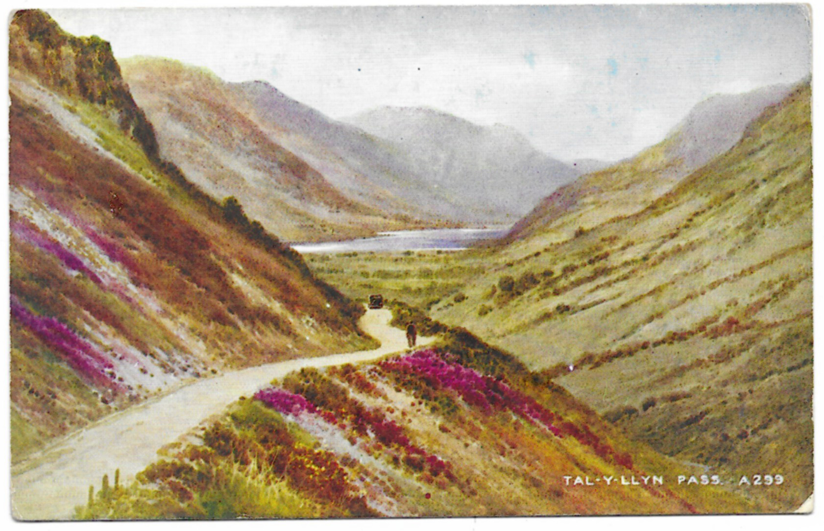 In the card to the left, the artist has tried to capture the pass on one of its more socially acceptable days, the colours evoking the valley on a typical cloud-on-blue-sky autumn day, with patches of deeply coloured heather, the lake a moody blue-grey, all very mellow and scenic. When the heather and broom flower together, purple and yellow, with the heather metamorphosing into bright rust as it goes over, the colour combinations produced could only ever work in nature, and they bring a brightness to the valley that transforms it. Unused, it is in the Valentine’s “Art Colour” series (number A299) and is from an original watercolour by Brian Gerald. There’s a lot of information about Valentine’s on the MetroPostcard website, which says that the Art Colour series were produced during the 1940s and 50s using the tricolor technique that was introduced by the company in the early 1900s: “The basic idea behind tricolor printing is to reproduce a full color image by printing with only three primary colors. This can be used to reproduce illustrations, but the primary goal was to create photo-based images in natural color. While this remained the ultimate goal it did not stop printers in the first half of the 20th century from utilizing the method in various ways that produced very unnatural looking pictures” (MetroPostcard.com).
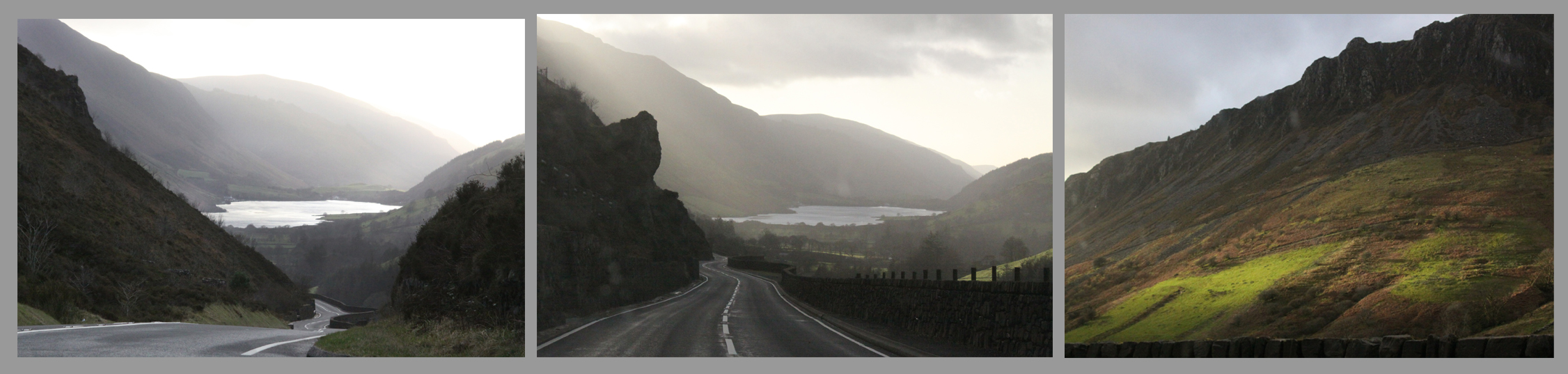 I took the photographs above on 3rd January 2020, silvery in sun and cloud, on my way back to Aberdovey from Chester, a singularly beautiful trip.
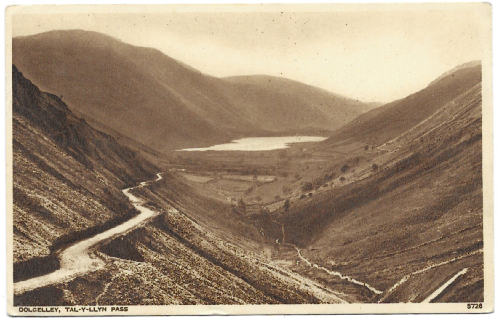 In the second photograph, the road and lake form a dramatic silver slash across the dark landscape, a sensational image. I suspect from the bright surface of the lake that it was actually a sunny day, but the darkness of the hillsides evoke the valley on one of its angrier autumn or winter moods. It was posted from Aberystwyth in August 1953 to an address in Warwickshire. The writer of the card asks the recipient to bake her a loaf for her return. It’s the first postcard in this blog series that was produced by Photochrom Co. Ltd., “Publishers to the World,” in Tunbridge Wells, number 5726. According to the MetroPostcard website, Photochrom originally produced Christmas cards before becoming a major publisher and printer of tourist albums, guide books, and postcards in black and white, monochrome, and colour.
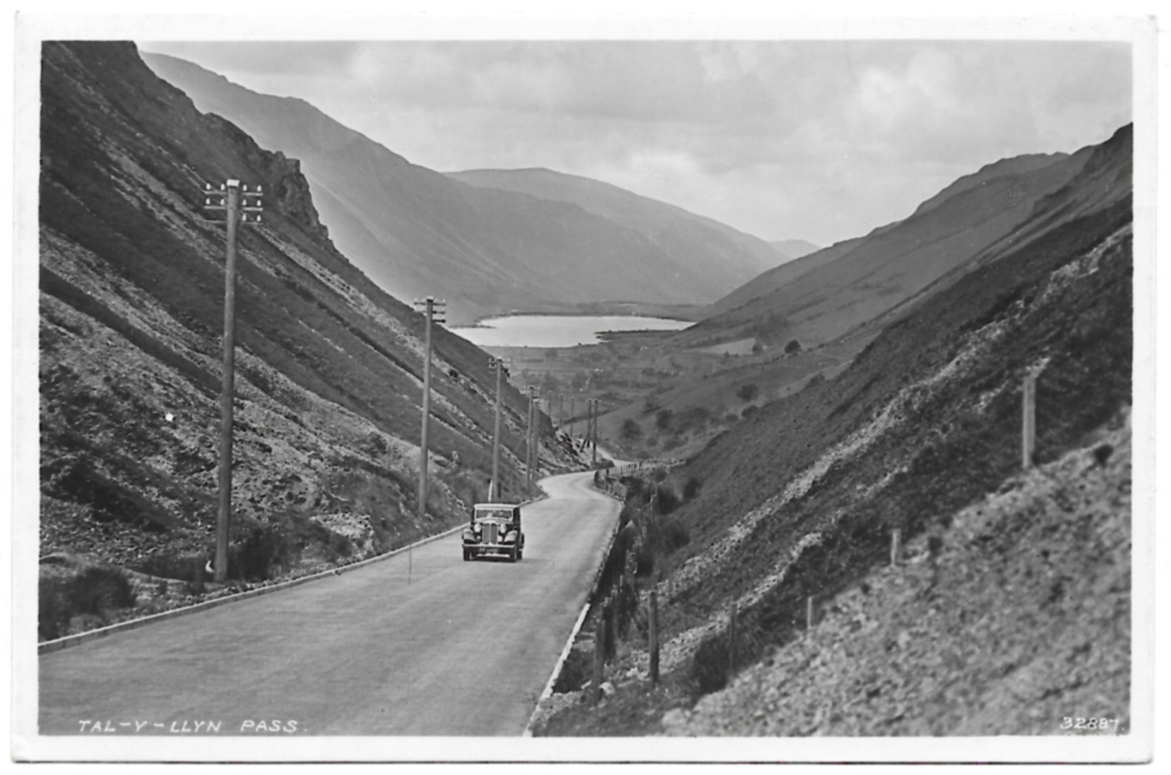 The third card, unused, is a delight less for the view than for the lovely car that drives straight up the middle of the road. Not that driving up the middle of the road is an uncommon sight in mid Wales, but here it carries much less risk than today! This is the only postcard that I have produced by Jones Corner Shop in Machynlleth, in their “Maglona” series. I assume that the series refers to the dubious identification of the name Maglona with the Roman fortlet Cefn Caer at Pennal, near Machynlleth. All of the photographs in the series were of local views.
